Thursday 10 March 2011

Music Magazine Table

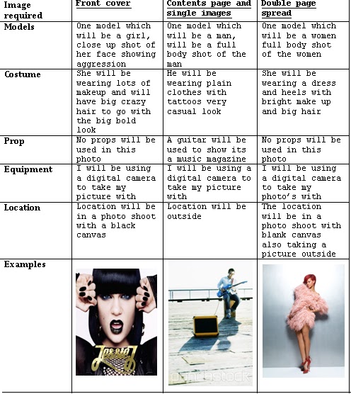
Before creating our music magazine we had to show what we was going to do, for example with our photos for each section of our music magazine, I decided to have a close up shot for my front cover to make a impact and in your face with bright colours and makeup.

For my contents page I decided to have a man in casual wear yet having a full body shot outside so you can see the background and surrounding also to make it the photo more bright and natural. With him playing the gituar it shows that it is a music magazine.

For my double page spread I also wanted a full body shot, making it fun and exciting so that people would be attracted to the magazine also wearing a dress and heels and with a blank canvas it will attract you more to the person which I want than have too much going on in the background.

Friday 18 February 2011

My chosen picture for my school magazine


This is my finial photo I had chosen for my school magazine, I decided to chose this photo because of the angle of the photo was nice as I could fit the text around the photo. Even though there are chairs behind the student I knew I could change and create a different colour background so that the text was clearer and more easier to see. I also picked this photo because the student looks smart, representable and is looking directly at the camrea so it shows they are connecting with the people that look at the magazine cover and makes them think that the student is looking at you which gets that person involed.

The student is doing work, which shows them in a good light and representing the school in a good way. So I thought if iI have this as my front cover than students would think to do more work and want to do more work. I also decided to chose this photo as the Student is smiling which would attract people as it doesn't seem dull, plain and boring.

I knew this photo had potential to make a really good school magazine, the only problem I had with this photo was the colour it came out darker than I expected which let it down because if the picture was brighter it would have looked more inviting and appealing to the eye. Yet you dont get as much wow factor when you look at it because the colours are very dim with the black and whites and greys but with bright, colourful text and exciting, playful fonts and a different coloured background I knew it would attract students of a mixture of different ages.


Thursday 17 February 2011

Annotated music magazine double page spread

Annotated music magazine double page spread

We also had to annotate double page spread's, to get an idea on what is in music magazines and how the people in these magazines are being represented.

Annotated music magazine contents page

Annotated music magazine contents page

We also had to annotate contents pages, to give me some ideas about how to design my own contents page.

Annotated music magazine front cover

Annotated front cover for music magazine

Contents page for music magazine

We have now started with a new topic, it is to do with music magazine's. I had to research on different music magazine front covers and annotate them.

Feedback on contents page

Annotated contents page for my school magazine

Unsuccessful photo for my school magazine front cover

I had taken many photos for our school magazine front cover, some were successful and some photos were unsuccessful, this was one of the unsuccessful photos that i took. This is because of the background as it is too distracting which takes all the attention off the student which is the main thing you are spoused to be looking at when you look at this photo. Also the picture is landscape so it wouldn't work as the photo has got to be portrait for the magazine otherwise it wouldn't have covered the whole of the page. Also the things that are surrounding the student for example the chair and paper scattered alll over the table which looks messy.

By taking these photo's for my school magazine it helped me to take a successful picture and gave me an insight on how to take the right picture and what a picture needs and doesn't need to make it successful .

Tuesday 15 February 2011

Feedback on school magazine front cover

this is the feeback i got from people that looked at my school magazine front cover, they commented on what they liked most about the magazine and what could be improved.

Monday 14 February 2011

My final desgin for my school magazine front cover

This is my final desgin for my front cover of a school magazine.
I decided to call my magazine "insight" because by looking at the front cover I am giving you an insight on what the magazine is going to be about and what is in the magazine.
The masthead "insight" is multi-coloured and stylish writing to attract the younger generation and make them want to buy the magaizne because of its funky look.
"School magazine" i put in smaller writing and a different font and spaced out so that it is clear to read yet attracts attention more to the masthead and nothing else.
The picture is a head to shoulders shot of a student doing his work, he is looking directly at the camrea smiling so that the person thinks he is looking at you which gives a connection.
I also used a mixture of shapes to make it look different with brightly coloured shapes to attract people to the magazine and darker colours for the backgrounds to make the text stand out even more.
"only £1" I decided to make it look fun with a yelllow star and multi-coloured text so that people will think to buy it because its only £1.
I used different fonts and sizes for every bit of the text on the magazine to make it different and to make it child friendly as its not boring and plain.

My desgin for my school magazine contents page


I had chosen to create my layout for my magazine contents page by putting the images of  students right hand side of the page because it makes the contents page look fun and exciting  as the students are smiling and doing school activites. Also the pictures are at different angles making it different and creative.

I decided to make the masthead "contents" in bright colours to attract people and make the magazine look inviting, with the big bold captial letters as it is the first thing you look at because it catches your eye especialy students.
I decided to use clear, neat font on the left hand side for the different sections of the magazine so that it is easy to read and not to complicated, simple yet effective at the same time.

Underneath the different sections of the magazine I decided to write pieces of infomataion for them to give people an insight on what the pages invole without looking through the whole of the magazine to find it.
I also used red for the page numbers because the colour red is very bright and with the captail letters and bigger text it will attract peoples attention. The light blue background I decided to use because it makes the black and red text stand out even more.


Thursday 6 January 2011

My desgin for the front cover of a school magazine

In my third desgin, I decided to call my magazine called "Explode" because the magazine has lots of things going on in it and it will attract students attentions as it is un usual and different. I also used purple and black colours which are very dark to make the text stand out also using captial letter's to make the magazine stand out and make a statement. The picture is of a student (girl) doing work on the computer, I did this to give a postive attitude to school and maybe if students looked at the front cover of the magazine it might encourge them to work more at school. I thought if I put less infomation on my magazine maybe the students will look at the cover and would want to know more about whats in it and by doing this they will buy the magazine. I think this magazine cover is simple yet effective at the same time as its not too over the top which will result in students wanting to read it because the front cover looks inviting.

Wednesday 5 January 2011

My desgin for the front cover of a school magazine

In my second desgin I decided to show a young boy putting his hand up. I done this because I wanted to show that the boy was getting involed at school and wanted him to be shown in a good light. He is dressed smart to represent the school and is looking straight at the camrea to show that the boy is looking at you. I wanted this magazine desgin to be fun and happy to attract students of all ages so I did this by using bright colours and big bold writing showing the important parts that was on the magazine cover. I chosen to call my magazine "Inspire" because I want the students to be inspired by this magazine showing all the fun elements yet at the same time showing the improtant infomation that is needed in a school magazine.

My desgin for the front cover of a school magaznie

In my first desgin I have shown a girl doing school work on a desk. I called the magainze "Insight" because on the front cover you are getting a slight insight of what the magazine is about making you want to buy it. The girl on the cover is looking very presentable as she is wearing smart clothing showing her in a good light. Also used the black bold text to highlight the most inportant parts of the magazine. Using different colours and different styles of font to attract students making the magazine look fun and inviting but at the same time representing the school.