Thursday, 6 January 2011
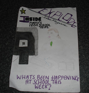
My desgin for the front cover of a school magazine
In my third desgin, I decided to call my magazine called "Explode" because the magazine has lots of things going on in it and it will attract students attentions as it is un usual and different. I also used purple and black colours which are very dark to make the text stand out also using captial letter's to make the magazine stand out and make a statement. The picture is of a student (girl) doing work on the computer, I did this to give a postive attitude to school and maybe if students looked at the front cover of the magazine it might encourge them to work more at school. I thought if I put less infomation on my magazine maybe the students will look at the cover and would want to know more about whats in it and by doing this they will buy the magazine. I think this magazine cover is simple yet effective at the same time as its not too over the top which will result in students wanting to read it because the front cover looks inviting.
Wednesday, 5 January 2011
My desgin for the front cover of a school magazine
In my second desgin I decided to show a young boy putting his hand up. I done this because I wanted to show that the boy was getting involed at school and wanted him to be shown in a good light. He is dressed smart to represent the school and is looking straight at the camrea to show that the boy is looking at you. I wanted this magazine desgin to be fun and happy to attract students of all ages so I did this by using bright colours and big bold writing showing the important parts that was on the magazine cover. I chosen to call my magazine "Inspire" because I want the students to be inspired by this magazine showing all the fun elements yet at the same time showing the improtant infomation that is needed in a school magazine.
My desgin for the front cover of a school magaznie
In my first desgin I have shown a girl doing school work on a desk. I called the magainze "Insight" because on the front cover you are getting a slight insight of what the magazine is about making you want to buy it. The girl on the cover is looking very presentable as she is wearing smart clothing showing her in a good light. Also used the black bold text to highlight the most inportant parts of the magazine. Using different colours and different styles of font to attract students making the magazine look fun and inviting but at the same time representing the school.
Subscribe to:
Comments (Atom)


